ExtraHop RevealX is an industry-leading Network Detection and Response (NDR) platform. It sees everything on a network–devices, traffic, and entities. It can live as a SaaS product or a physical sensor on-premises.

Color System & Accessibility Framework_
Context
As the solo designer, I spearheaded the overhaul of our UI color architecture, collaborating with a QA designer who assisted with final compliance verification.
Problem
The product’s color system was completely unorganized; years of fragmented development across multiple teams had led to an exponential growth of hardcoded, custom color overrides that broke visual hierarchy and violated accessibility standards.
Process
- Audit: I mapped existing coded colors and identified critical contrast failures where UI elements nested on dark panels.
- Hypothesis Testing: I initially built a standard linear color scale using equal 10% mathematical increments.
- Pivot & Rejection: I rejected the linear scale because it failed to provide enough subtlety at the extreme ends of the gradient, where background and text colors require precise contrast ratios.
- Iteration: I pivoted to a proportional, non-linear shade distribution that tightened the spacing near the gradient edges, ensuring reliable contrast while maintaining an elegant dark-mode aesthetic.
Proposal
I delivered a unified, predictable token system and color map built on this custom-weighted scale, featuring a foundational dark theme and an exaggerated high-contrast theme optimized for low-quality enterprise monitors and aging projectors. The architecture explicitly mapped nested panel logic and included built-in “rainbow” variable slots (like pinks and purples) to future-proof the system for upcoming maturity milestones.
Result
The framework consolidated hundreds of rogue variables into a tight, scalable palette, achieving full WCAG compliance and clearing the visual accessibility hurdles required for FedRAMP federal certification. Furthermore, the foresight of the extended color map allowed our team to seamlessly execute a major company rebranding and deploy complex status tag updates in a fraction of the standard development time.


Detection Optimization Guide_
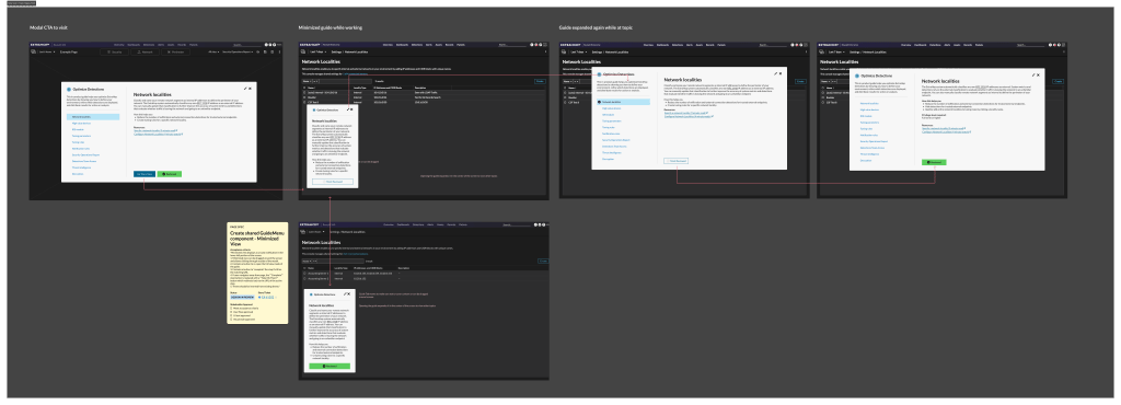
The best possible experience with the RevealX product requires some configuration. New users take a while to orient themselves in the system. I created a guide that covers common configuration options and gives a tour of the system at the same time. Users can access the guide at anytime. They can also mark if a step is completed. Users can unmark the step to treat the guide like a checklist as it is recommended to revisit these configurations over time.
View Case Study Details →


Flow of splash screen with release notes modal with callout to a new icon and teaching animation. This icon would be the home for this and future guides inside the mega menu.


Security Operations Report to Show Value_
Context
As the lead UX designer for ExtraHop RevealX, I spearheaded the multi-iteration redesign of our core executive reporting feature, transforming a dense product feature document into a high-level strategic asset for security leaders.
Problem
The existing “Executive Report” was a generic, leave-behind PDF that simply listed product features rather than addressing the true user need: providing Chief Information Security Officers (CISOs) and analysts with clear, scannable data to prove security effectiveness to senior leadership.
Process
- User & Stakeholder Research: I synthesized insights from extensive interviews with security analysts, CISOs, sales engineers, and customer service teams to identify what metrics actually resonate in a board meeting.
- Information Architecture: I isolated the product’s six core pillars—Attack Surface, Threat Coverage, Attack Detections, Investigation & Response, Perimeter, and Security Hardening—and determined the primary business driver for each.
- Pivoting & Rejection: I rejected the traditional portrait-oriented document layout. User research revealed that these reports were almost always converted into presentation slides for quarterly reviews, so I pivoted the entire canvas framework to a landscape presentation slide format that seamlessly pulled double duty for both print and digital projection.
Proposal
I designed the “SecOps Report,” a modular reporting framework structured with progressive disclosure. The first few pages provide a high-level, landscape-oriented executive dashboard summarizing the six core security pillars, built specifically to fit standard presentation decks. The subsequent sections allow users to drill down into technical data granularity, ensuring the document provides value to both high-level executives and the analysts preparing the briefings.
Result
The redesigned report successfully consolidated complex network telemetry into an executive-ready narrative. By aligning the format directly with the customer’s actual workflow (boardroom presentations), we significantly increased report generation utility, eliminated the need for manual slide recreation, and provided a powerful tool for security teams to demonstrate ROI and security posture health to senior leadership.


UX Configuration workflow and tool for Enterprise Kubernetes Integration_
Context
As the lead UX designer, I spent several quarters collaborating with the software architecture team to design the end-to-end integration workflow for ExtraHop RevealX to monitor internal Kubernetes cluster traffic via hardware or software sensors.
Problem
Deploying monitoring agents inside an enterprise cluster required dense technical configurations (API keys, security permissions, and cluster-level access) that lacked a cohesive user journey, threatening to create a high-friction, error-prone setup experience for network administrators.
Process
- Requirements Discovery: I audited user technical profiles, defining the baseline comfort level for cluster administrators managing complex cloud environments.
- Security & Logic Mapping: I mapped out the complex relationship between API key storage and cluster permissions, identifying a critical security risk regarding which user roles should see or manage raw keys.
- Pivoting & Rejection: I aggressively advocated for a strict one-to-one relationship between API keys and sensors, rejecting an initial engineering proposal to utilize a single shared key across multiple sensors. I anticipated how different user roles would interact with the system over time and recognized that while a 1:1 ratio might feel restrictive during the initial deployment of multiple sensors, later it would be easier to manage keys and potentially remove or replace sensors.
- Validation: I developed the “happy path” architecture and continuously stress-tested it through iterative review cycles with technical leads and customer focus groups.
Proposal
I designed a multi-phase deployment architecture managed entirely through a streamlined Helm Chart generation execution. Phase 1 focused on secure, contextual API key population during the initial configuration generation, while Phase 2 consolidated the management lifecycle of those keys. The final solution optimized permission scopes, masked sensitive keys from unauthorized viewers, and provided a forgiving, minimal-step configuration file generation.
Result
By translating highly complex back-end constraints into a structured, logical flow, we delivered a secure and scalable integration path. The unified Helm Chart strategy eliminated setup ambiguity, minimized deployment errors, and ensured the enterprise-grade API security required for frictionless onboarding into sensitive cluster environments.


The first configuration flow. It was very intensive based on the location of the API key associated with the integration. This was a single page that was used to issue an API key and have it be automatically included in the YAML file. A lot of hard work and several security updates, was able to reduce the steps to be three major steps.

Visual Threat Intelligence & In-Product Attack Diagrams_
Context
As the lead UX designer for ExtraHop RevealX, I collaborated closely with our internal detection engineering teams to build a visual, context-aware threat intelligence framework into the core product detection library.
Problem
When investigating high-threshold security alerts, analysts and CISOs frequently had to step away from the product—or manually reconstruct the attack vectors in their heads—just to recall the exact mechanics of a specific threat, introducing critical delays during high-stress triages.
Process
- RUser Insight: Through interviews with security analysts across all tiers, I observed a recurring pattern of context-switching where users left the tool to look up attack definitions.
- Technical Deep-Dives: I instituted regular alignment sessions with the detection teams to dissect complex threat behaviors and isolate the exact network “smoking gun” action for each attack.
- Pivoting & Rejection: I rejected standard, text-heavy glossary entries. Text alone failed to quickly communicate the spatial and behavioral progression of network threats, pushing me to pursue a purely visual, diagrammatic approach instead.
Proposal
I designed an integrated, visual attack glossary embedded directly into the product’s alert background panels for all major detections. Each panel features a custom, simplified architecture diagram that maps out the attack lifecycle—ranging from initial reconnaissance up to actions on the objective—allowing analysts to immediately visualize the threat campaign. To drive engagement and training, I also translated this system into a physical, gamified card deck where card combinations model the Cyber Kill Chain to show what a fully compromised target looks like.
Result
By embedding visual threat intelligence directly into the detection workflow, we eliminated out-of-product context-switching and dramatically reduced cognitive load for security teams. Transforming abstract, complex network telemetry into immediate, scannable “smoking gun” diagrams significantly accelerated investigation velocity and gave analysts the instant clarity needed to confidently respond to active threats.


Icons, Logos, and Threat Briefings_
I’ve made the icons for the product, presentations, architecture illustrations, and logos for the Threat Briefings. Icons in the product could be functional as either a role, activity, or wayfinder. Icons inside detection diagrams create a visual library of meanings to describe elements of an attack. The threat briefing logos came from attackers taking pride in their attacks and creating their own mark for the attack. I thought there might be some fun in returning to the practice and trying to get more SEO hits with our logos if they were included in blog logos. The first one is for Bad Neighbor, which was the first threat briefing, and it came out on Halloween.
Threat briefings are usually associated with threat events or attacks that are sent to customers to help show coverage. They consist of attack backgrounds, links to CVEs or resource documents, detections, and records associated with the event. I would work with the detection team to learn about the attack and create a narrative illustration or logo that would appear at the top of the threat briefing. This is also in a thumbnail version with the listing on the Overview Landing screen of the product and in the threat briefing catalog/archive.


Appliance Branding, diagrams, and status window_
The smallest appliance of the ExtraHop family is usually in a place that has a lot of traffic. While I provide designs for all of the different appliances, this one has the most options for customization on the chassis. I work with the hardware team and vendors directly to get specs and find out what’s available within budget to provide branding and a great out-of-the-box experience. I feel this is a great way to begin a relationship well by making the package easy to install. I’ve included diagrams on the interior of the box to also show the level of detail that makes our delivery appear thoughtful.


Concept Art_
The original UI needed a lot of work. To make the case for a major uplift, it was helpful to have some concepts to present of a mature product. RevealX has a ton of data density and very few places at the time to provide visual context to the data. What was important was to showcase the product in a way that was visually helpful and had a few showcase screens. Finally, this needs to look good on a SOC (Security Operations Center) wall and run in the background.
- Who needs this? Is this still useful to the CISO or the analyst?
- Is this the best way to view this data? Geomaps are common, but do they still do an effective job at visualizing this data?
- What needs to be shown? What might be useless?
- Are you tracking this now, and if so, how?
- How will we review this? Who will review this? When is this useful?
- What does the customer think this should be showing?
When these questions were answered sufficiently to begin concepting. I consulted with the lead developer to learn about what is possible to construct in the UI and what is not.


