ExtraHop
→ 6 Case Studies
Delivery_
UI / UX Workflow
Art Direction
Visual Identity
Iconography
About_
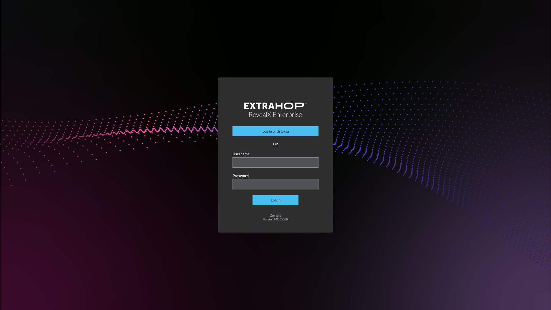
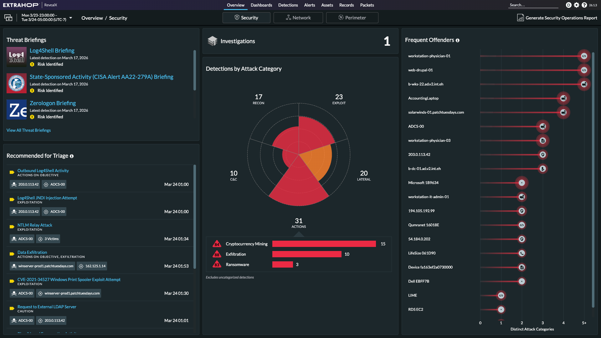
ExtraHop can see everything on your network. It is a platform for Network Security and Response that monitors all network traffic and can extract packet-level information to reveal potential threats as they occur in real time. The data-rich UI can exist on either a virtual or physical device, which may be airgapped for greater security. This product is complex and provides a lot of exciting design challenges.
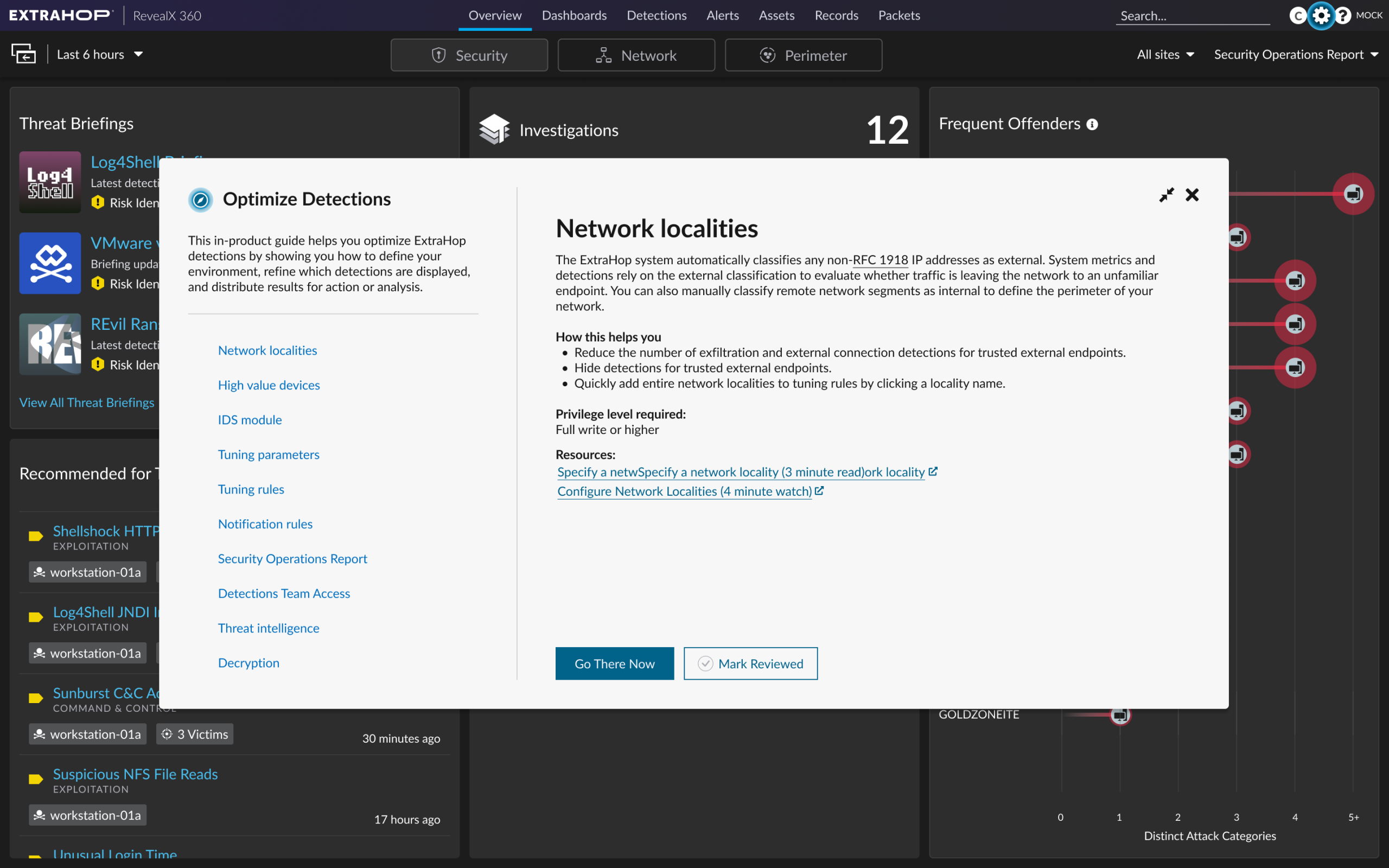
Originally, I was brought in to provide a designer’s eye, extend branding into the product, and provide a cohesive visual language. As the product matured, so did the role, evolving into a UI/UX hybrid and creating workflows throughout many areas of the product.
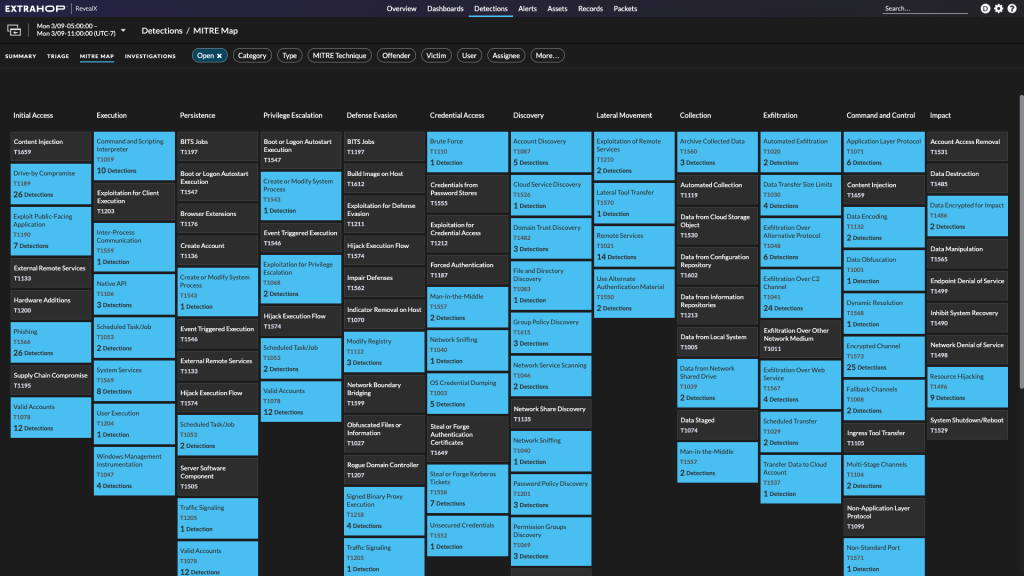
In addition to this role, I also provided end-to-end identity by designing the configuration screens, status screens, onboarding guides, and design for the appliance chassis and packaging. I was also brought in to illustrate proposed architectures, customer roadmap presentations, and all diagrams of attack tactics to be included in our detection library descriptions. I later turned these diagrams into a collectible deck of cards called “The Threat Deck,” which ranked techniques based on risk.
Design_
- Feature Workflows: Security Operations Reporting, Threat briefings, Integrations and Marketplace, Kubernetes cluster connection and API management, Themes, MITRE Map, Cloud Administration Interface, Investigations, and Onboarding
- Design System Library management
- Co-branding for integrations
- Branding for software identification
- Icon creation
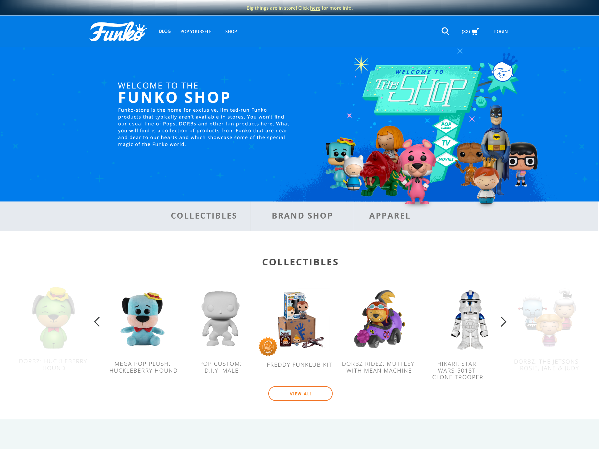
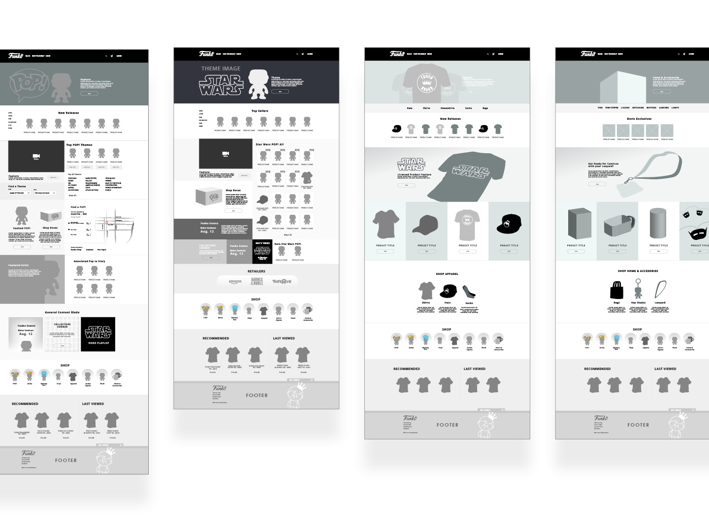
Funko Shop
→ Case Study
Delivery_
Art Direction
UX Design
Art Direction
Production Assets
Visual Identity
About_
Funko produces a pop culture products. They are most known for their vinyl figurines of pop culture icons. The collections of “Pops” are huge and they needed a store on their site that both sells and indexes the different Pops that are available. After customer research and learning about the way people collect them, I went to work.
Design_
Most avid collectors keep their Pops on display on shelves or in boxes that are stacked so you can see them like they are on shelves. I wanted to display them as if the Pops are on view in their collection. There were also special edition Pops boxes that required their own landing page. In the end, it was important that for display and unification of the design, a spec document and coaching for the production team needed to be outlined.
HCA Nursing
Career App
→ Case Study
Delivery_
Art Direction
Product Design
UX Design
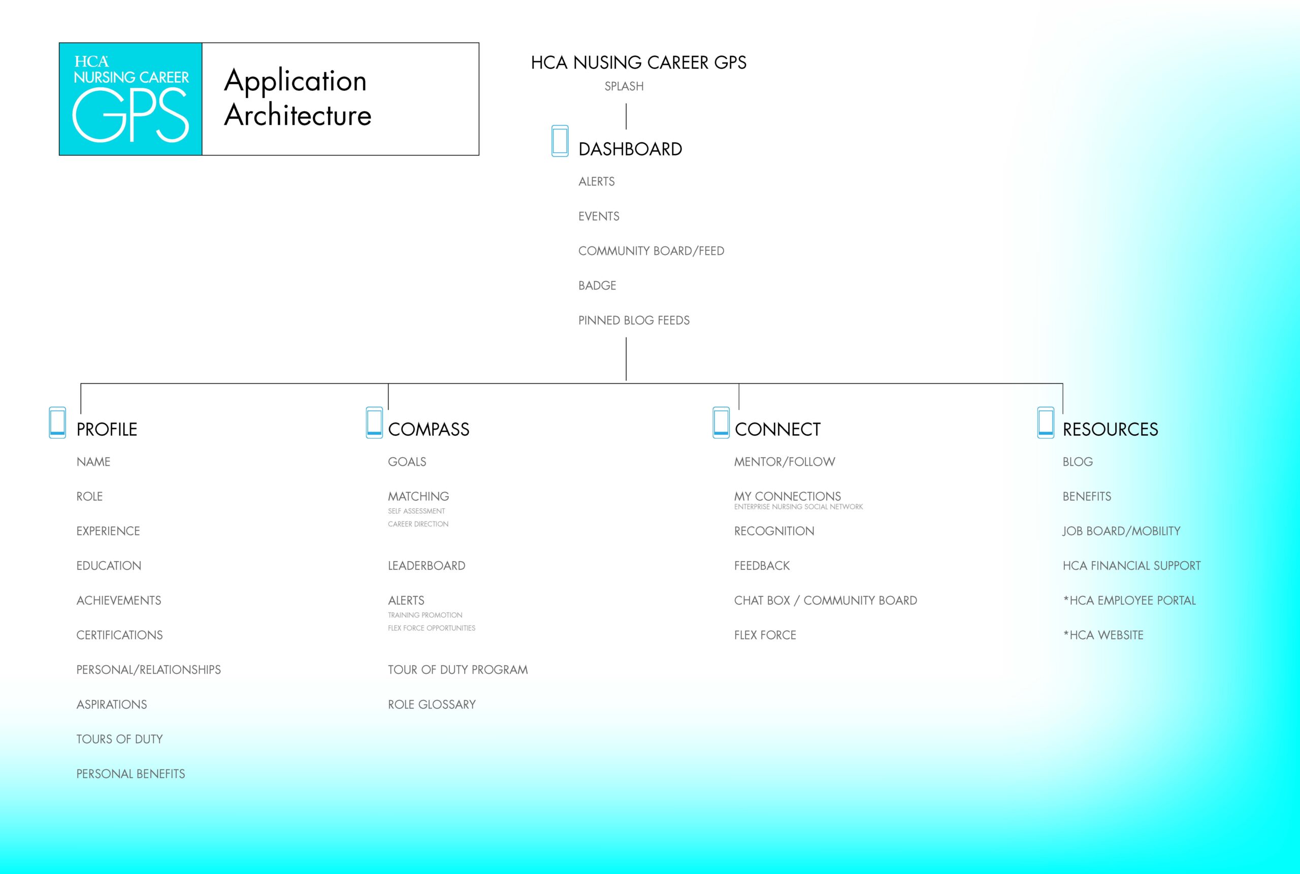
Information Architecture
About_
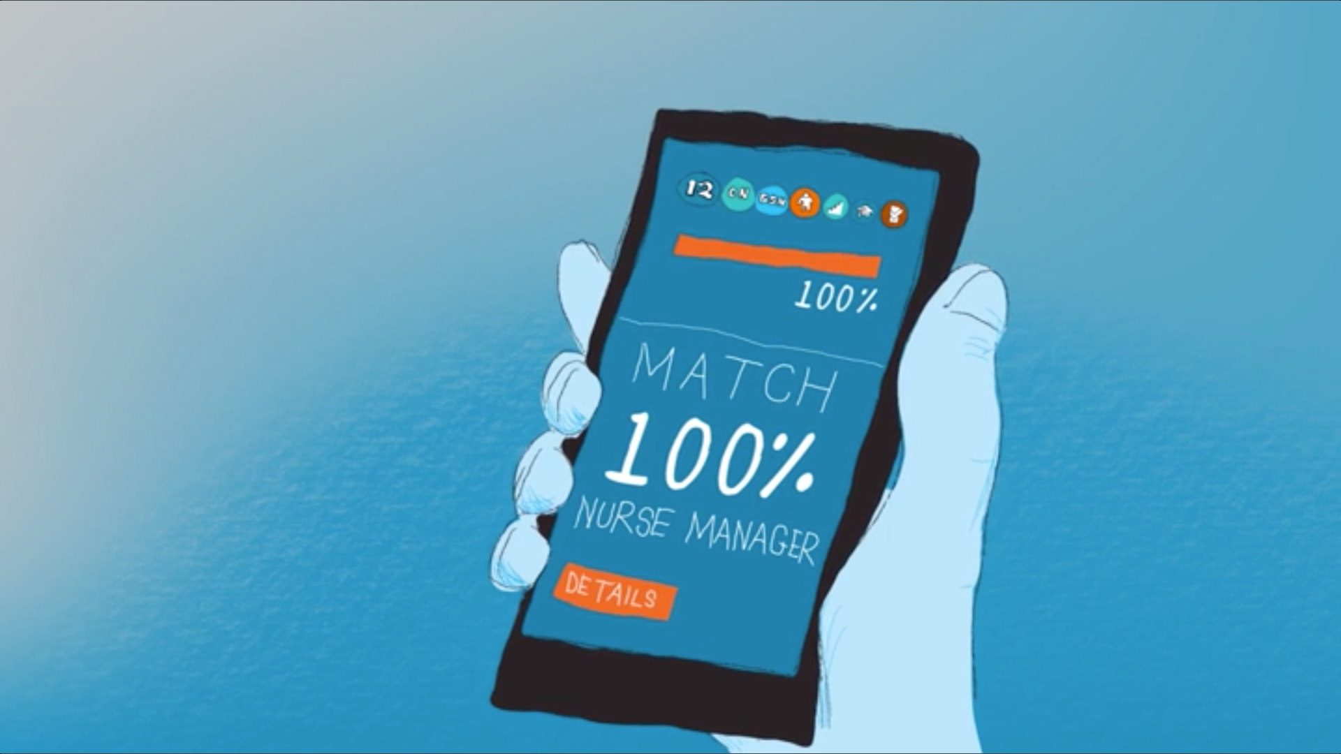
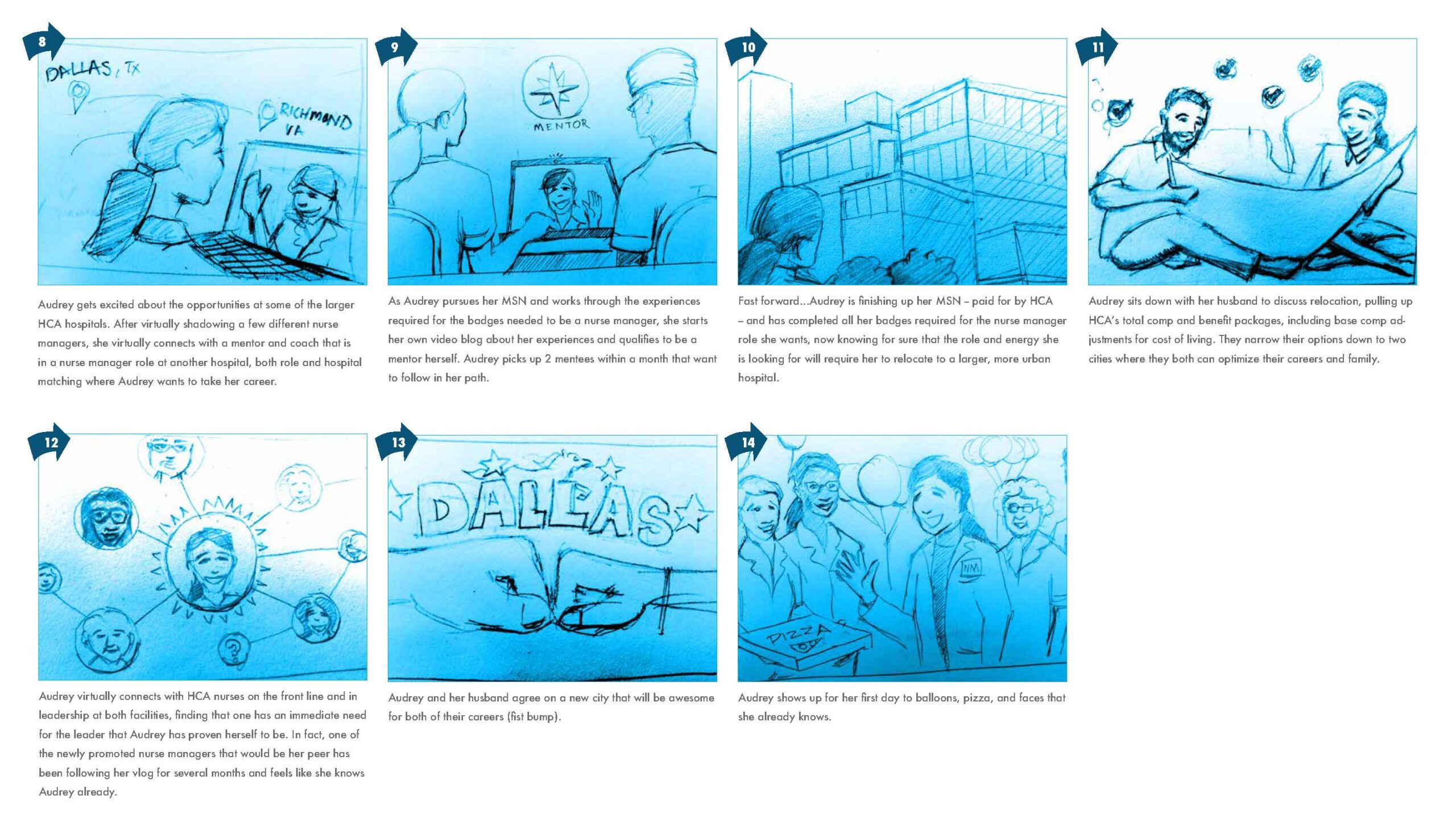
HCA wanted to support nurses with a mentorship program. This enabled both better-trained nurses and a path for advancement. An app that a nurse can take with them on their shift allows them to connect with their mentor on the go and provides a way to track goals. HCA staff needed a way to share their vision wth management.
Design_
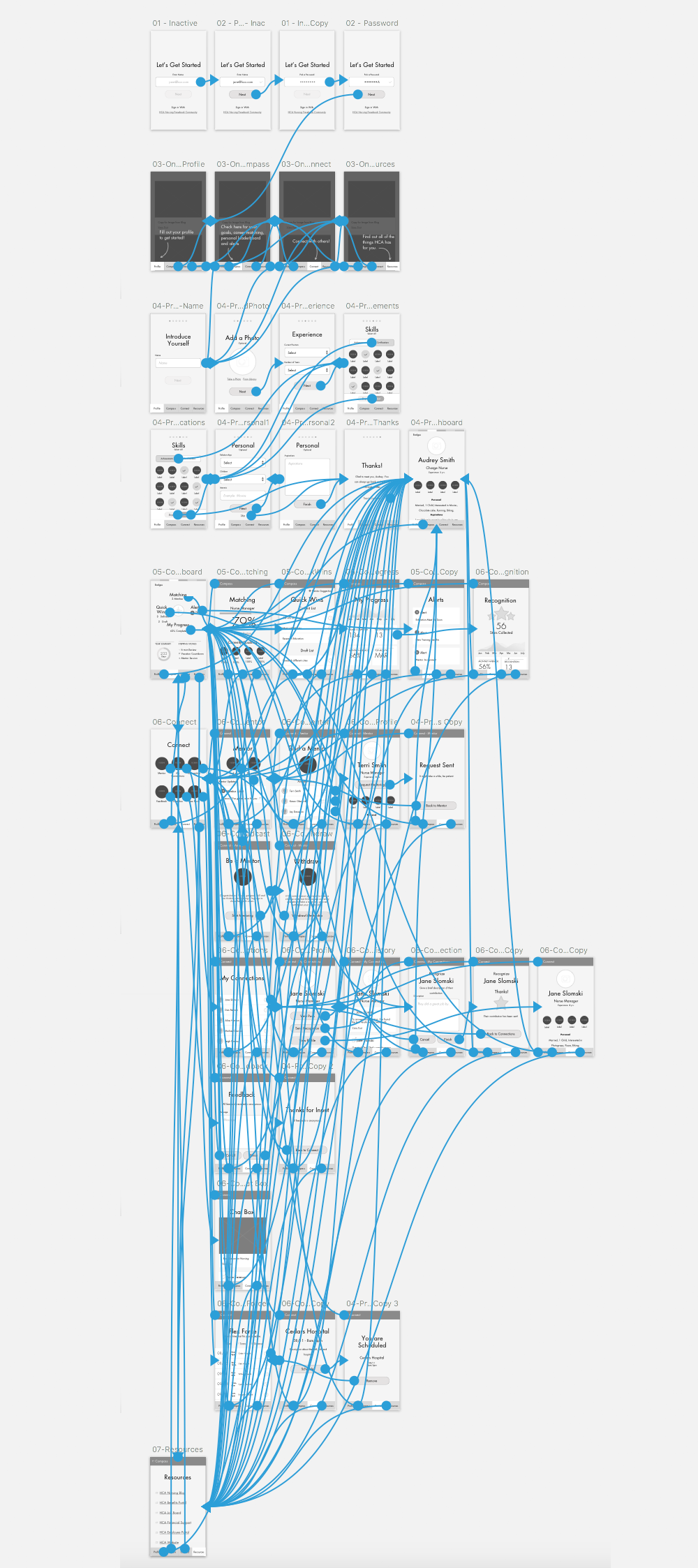
Using a combination of persona research and user insight, I created a visual customer journey, content architecture, and prototype application to be used to inspire investment in the program and application.
Barclaycard
Digital Wallet
→ Case Study
Delivery_
Art Direction
Illustration
Persona Development
UX Design
Product Design
Visual Identity
About_
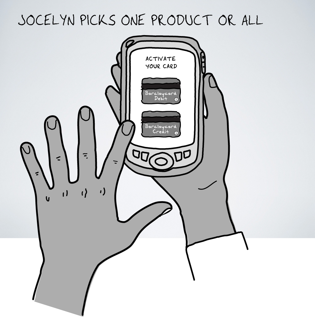
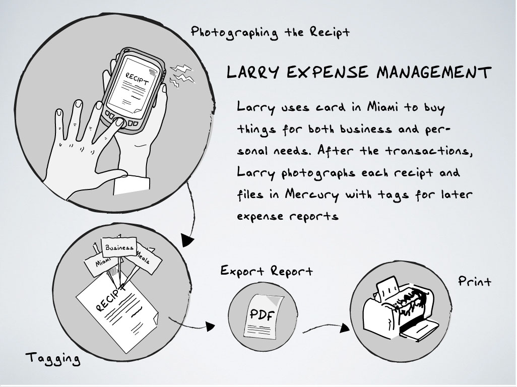
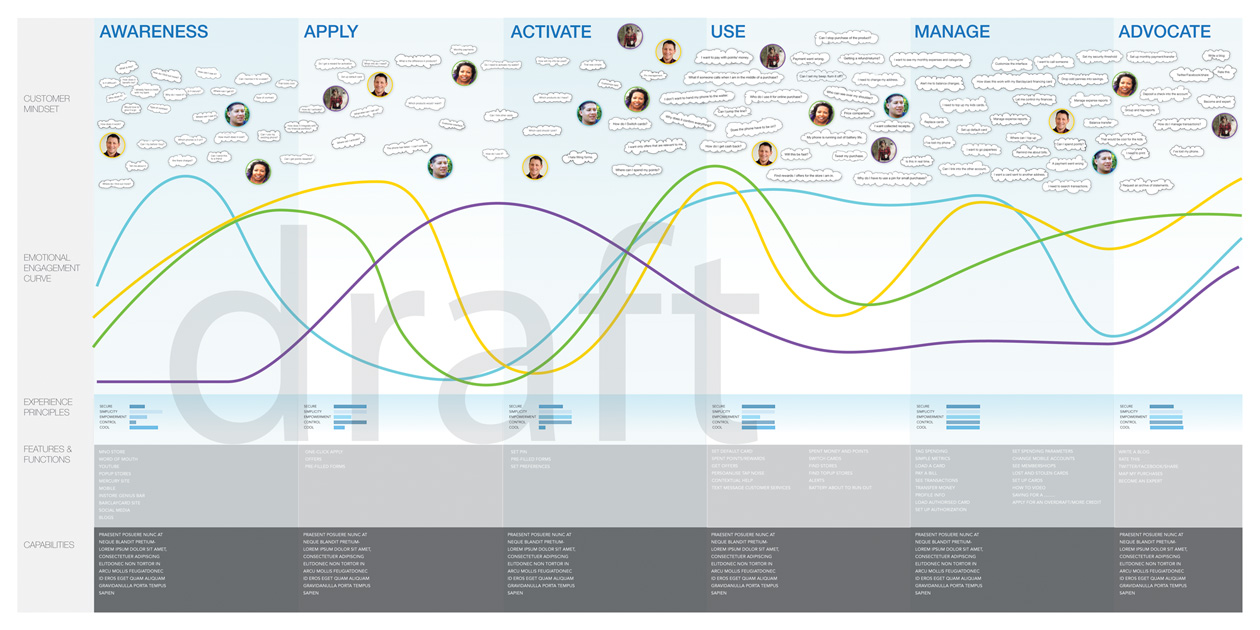
Barclaycard created a digital wallet application. Users could select credit cards to be used for RFID payment systems – much like modern Apple Pay. At the time, this was the first digital wallet available in the European market. Because this was a brand-new idea, a lot of storytelling was important to make stakeholders feel comfortable with this revolutionary idea. I also had to work in stealth mode, states away from my home.
Design_
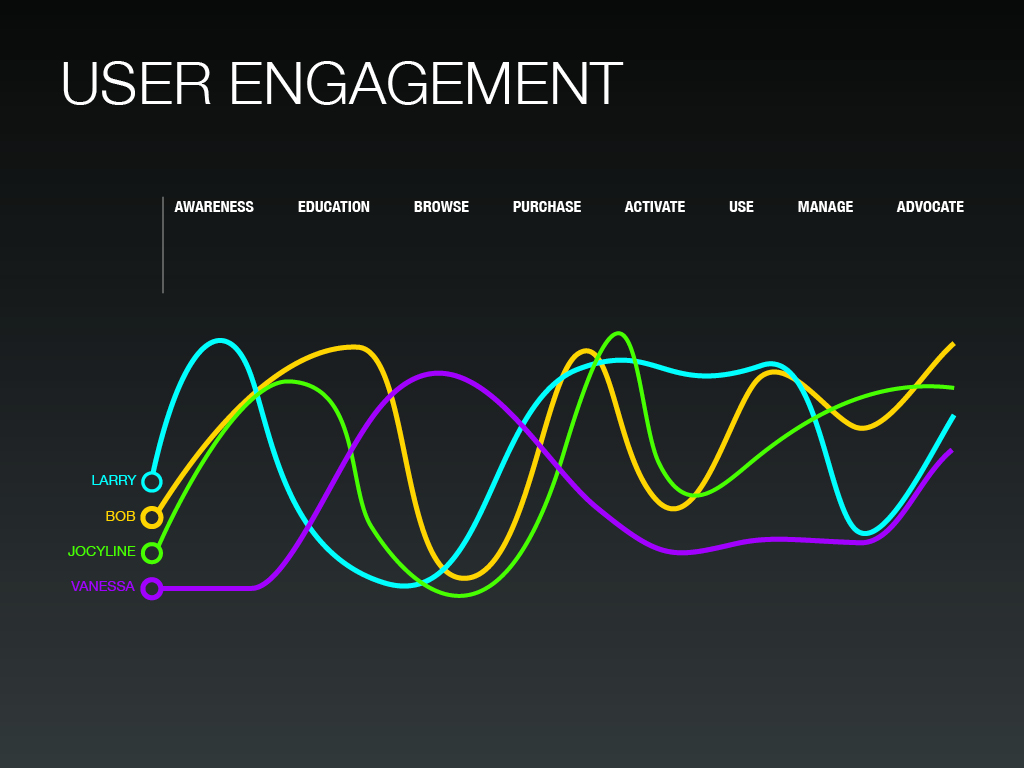
I turned some customer research into personas and storyboards to help stakeholders visualize the user journey. The research included customer demographics, financial goals, and personal habits. I hand-illustrated the user journeys, engagement, and scamped the first round of workflows for the product. It was released only in the European market. I was excited to find out later that the initial design of the scamps was so well-received that it made it into the first run of the product.
Globalstar
SPOT Device Activation

Delivery_
Art Direction
UX Design
UI Design
About_
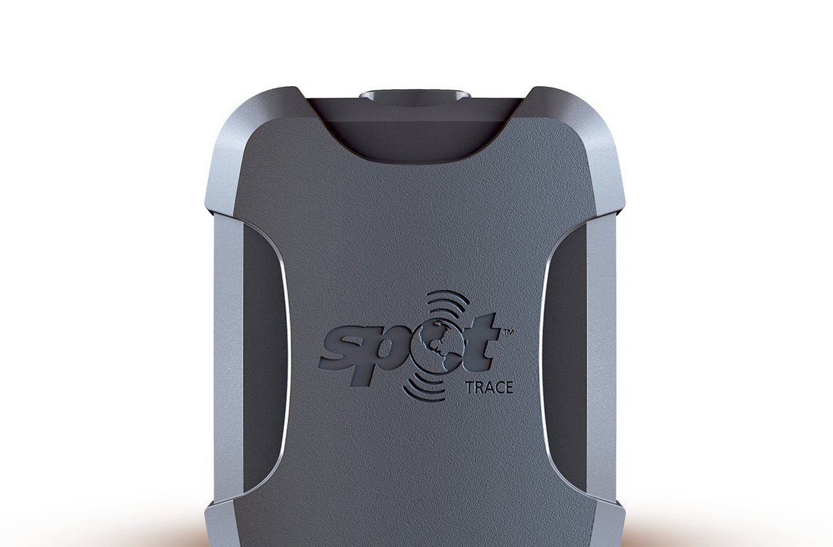
Globalstar is a leading GPS beaconing device manufacturer. They were launching a product into the consumer market that allows customers to use the device for tracking. Use cases for this would be either a global location for adventure travel or putting devices in things (boats) that owners would like to track for security purposes. Currently, the devices are targeted at corporations that wish to track containers on ships, so the system should be considered flexible enough to allow for many devices to be cataloged and set up quickly.
Design_
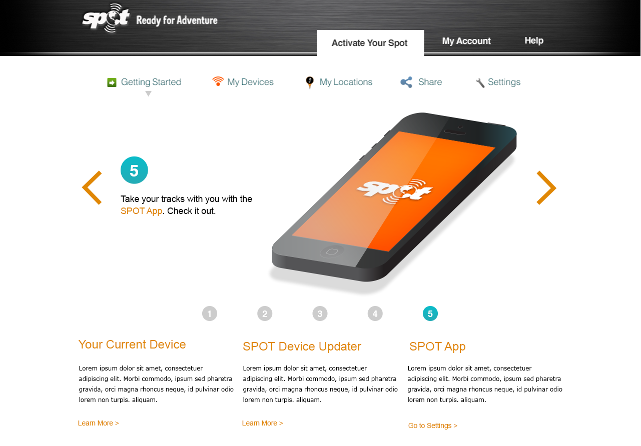
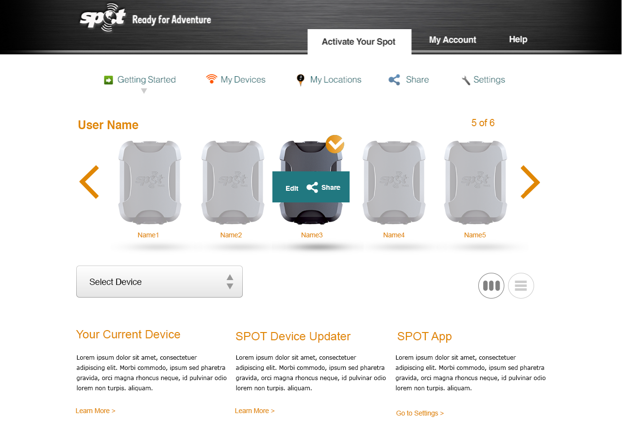
After collecting information for the goals of the project and user behavior, I began to wireframe out the user activation flow. I created a flow for user creation in relation to a device. I also created a flow for looking at a large number of devices and monitoring their activation.